- template default投稿者: tenman
top page
Top home blog logged-in admin-bar wp-custom-logo wp-embed-responsive wp-theme-emulsion-new metaslider-plugin emulsion is-presentation-fse summary post-type-default emulsion-addons-inactive is-tpl-index_template is-fse-light-global is-fse-bg-fefefe fse-scheme-default is-wp_template-index customize-support home blog logged-in admin-bar wp-custom-logo wp-embed-responsive wp-theme-emulsion-new metaslider-plugin emulsion-has-sidebar is-fse-light-global is-fse-bg-fefefe fse-scheme-default enable-alignfull emulsion emulsion-fse-active summary excerpt is-presentation-theme is-tpl-index-php post-type-default customize-support disable-sidebar-sticky home blog logged-in admin-bar wp-custom-logo wp-embed-responsive wp-theme-emulsion-new metaslider-plugin emulsion is-presentation-fse summary post-type-default emulsion-addons-inactive is-tpl-wp-index_template is-fse-light-global is-fse-bg-fefefe fse-scheme-default is-wp_template-front-page customize-support 投稿 wp-singular post-template-default single single-post postid-112381 single-format-standard logged-in admin-bar wp-custom-logo wp-embed-responsive wp-theme-emulsion-new metaslider-plugin emulsion is-presentation-fse has-block post-type-default emulsion-addons-inactive is-tpl-single_template is-fse-light-global is-fse-bg-fefefe fse-scheme-default is-wp_template-single customize-support wp-singular post-template-default single single-post postid-112381 single-format-standard logged-in admin-bar wp-custom-logo wp-embed-responsive wp-theme-emulsion-new metaslider-plugin emulsion-has-sidebar is-fse-light-global is-fse-bg-fefefe fse-scheme-default is-singular is-comments-open enable-alignfull emulsion by-tenman has-block emulsion-fse-active full_text is-presentation-theme is-tpl-singular-php post-type-default customize-support disable-sidebar-sticky 固定ページ wp-singular page-template-default page page-id-353 logged-in admin-bar wp-custom-logo wp-embed-responsive wp-theme-emulsion-new metaslider-plugin emulsion is-presentation-fse has-block post-type-default emulsion-addons-inactive is-tpl-page_template is-fse-light-global is-fse-bg-fefefe fse-scheme-default is-wp_template-page customize-support wp-singular page-template-default page page-id-108451 logged-in admin-bar wp-custom-logo wp-embed-responsive wp-theme-emulsion-new metaslider-plugin emulsion-no-sidebar is-fse-light-global is-fse-bg-fefefe fse-scheme-default is-singular is-comments-close enable-alignfull emulsion by-tenman has-block emulsion-fse-active full_text is-presentation-theme is-tpl-singular-php post-type-default customize-support disable-sidebar-sticky カスタム投稿 news wp-singular news-template-default single single-news postid-43120 logged-in admin-bar wp-custom-logo wp-embed-responsive wp-theme-emulsion-new metaslider-plugin emulsion is-presentation-fse has-block post-type-custom emulsion-addons-inactive is-tpl-default_template is-fse-light-global is-fse-bg-fefefe fse-scheme-default is-wp_template-single customize-support wp-singular news-template-default single single-news postid-43120 logged-in admin-bar wp-custom-logo wp-embed-responsive wp-theme-emulsion-new metaslider-plugin emulsion-has-sidebar is-fse-light-global is-fse-bg-fefefe fse-scheme-default is-singular is-comments-close enable-alignfull emulsion by-tenman has-block emulsion-fse-active full_text is-presentation-theme is-tpl-singular-php post-type-custom customize-support disable-sidebar-sticky カスタム投稿 news カテゴリ archive tax-news_cat term-first term-324 logged-in admin-bar wp-custom-logo wp-embed-responsive wp-theme-emulsion-new metaslider-plugin emulsion is-presentation-fse summary post-type-custom emulsion-addons-inactive is-tpl-taxonomy_template is-fse-light-global is-fse-bg-fefefe fse-scheme-default is-wp_template-taxonomy customize-support archive tax-news_cat term-first term-324 logged-in admin-bar wp-custom-logo wp-embed-responsive wp-theme-emulsion-new metaslider-plugin emulsion-has-sidebar is-fse-light-global is-fse-bg-fefefe fse-scheme-default enable-alignfull emulsion emulsion-fse-active summary excerpt is-presentation-theme is-tpl-index-php post-type-custom customize-support disable-sidebar-sticky カテゴリー archive category category-unit-test category-2 logged-in admin-bar wp-custom-logo wp-embed-responsive wp-theme-emulsion-new metaslider-plugin emulsion is-presentation-fse summary post-type-default emulsion-addons-inactive is-tpl-index_template is-fse-light-global is-fse-bg-fefefe fse-scheme-default is-wp_template-index customize-support archive category category-unit-test category-2 logged-in admin-bar wp-custom-logo wp-embed-responsive wp-theme-emulsion-new metaslider-plugin emulsion-has-sidebar is-fse-light-global is-fse-bg-fefefe fse-scheme-default enable-alignfull emulsion emulsion-fse-active summary excerpt is-presentation-theme is-tpl-index-php post-type-default customize-support disable-sidebar-sticky タグ archive tag tag-alignment tag-119 logged-in admin-bar wp-custom-logo wp-embed-responsive wp-theme-emulsion-new metaslider-plugin emulsion is-presentation-fse summary post-type-default emulsion-addons-inactive is-tpl-index_template is-fse-light-global is-fse-bg-fefefe fse-scheme-default is-wp_template-index customize-support archive tag tag-alignment tag-119 logged-in admin-bar wp-custom-logo wp-embed-responsive wp-theme-emulsion-new metaslider-plugin emulsion-has-sidebar is-fse-light-global is-fse-bg-fefefe fse-scheme-default enable-alignfull emulsion emulsion-fse-active summary excerpt is-presentation-theme is-tpl-index-php post-type-default customize-support disable-sidebar-sticky プライバシーテンプレート privacy-policy wp-singular page-template-default page page-id-101441 logged-in admin-bar wp-custom-logo wp-embed-responsive wp-theme-emulsion-new metaslider-plugin emulsion is-presentation-fse has-block post-type-default emulsion-addons-inactive is-tpl-privacy-policy_template is-fse-light-global is-fse-bg-fefefe fse-scheme-default is-wp_template-privacy-policy customize-support privacy-policy wp-singular page-template-default page page-id-101441 logged-in admin-bar wp-custom-logo wp-embed-responsive wp-theme-emulsion-new metaslider-plugin emulsion-no-sidebar is-fse-light-global is-fse-bg-fefefe fse-scheme-default is-singular is-comments-close enable-alignfull emulsion by-tenman has-block emulsion-fse-active full_text is-presentation-theme is-tpl-singular-php post-type-default customize-support disable-sidebar-sticky - test投稿者: tenman

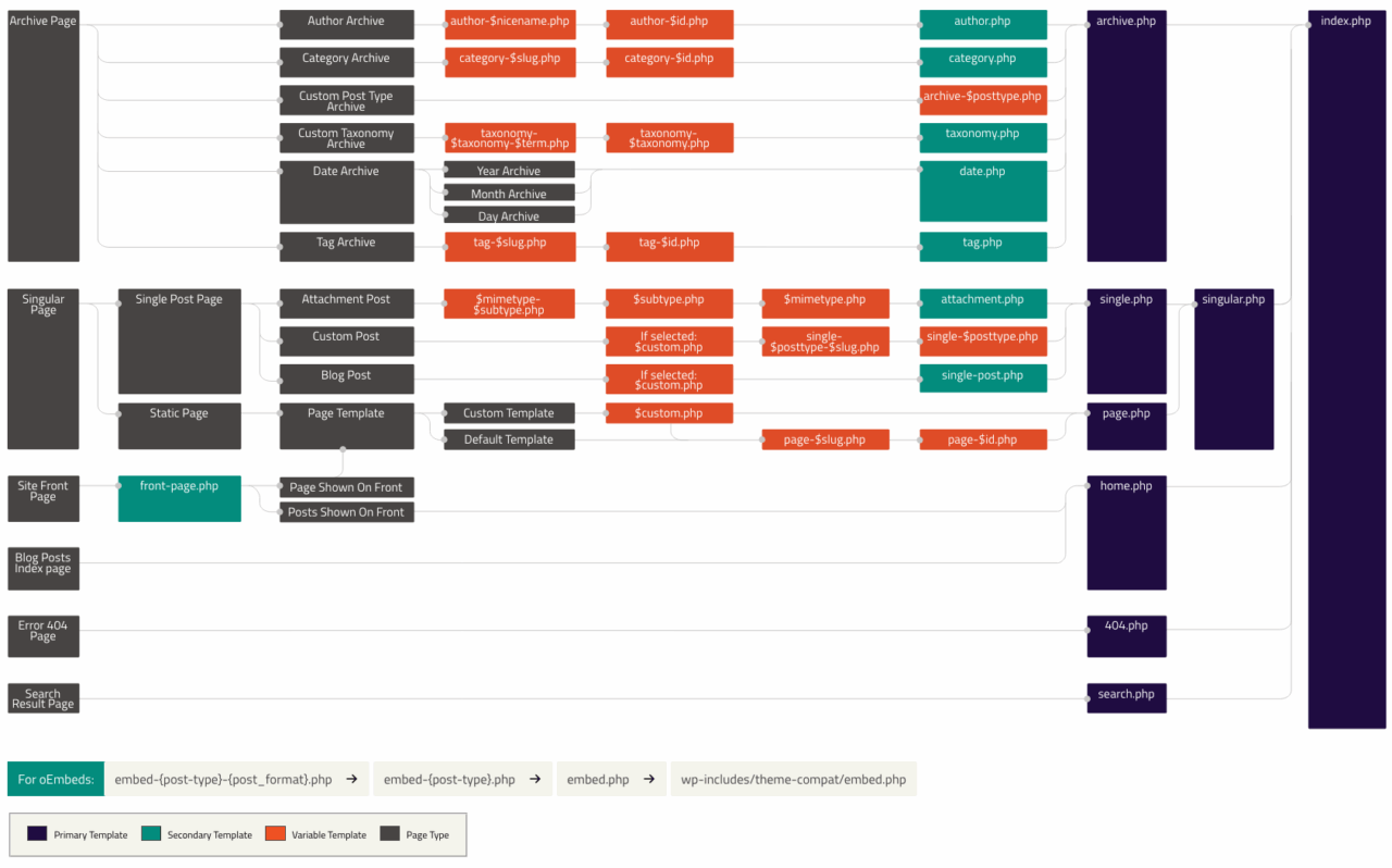
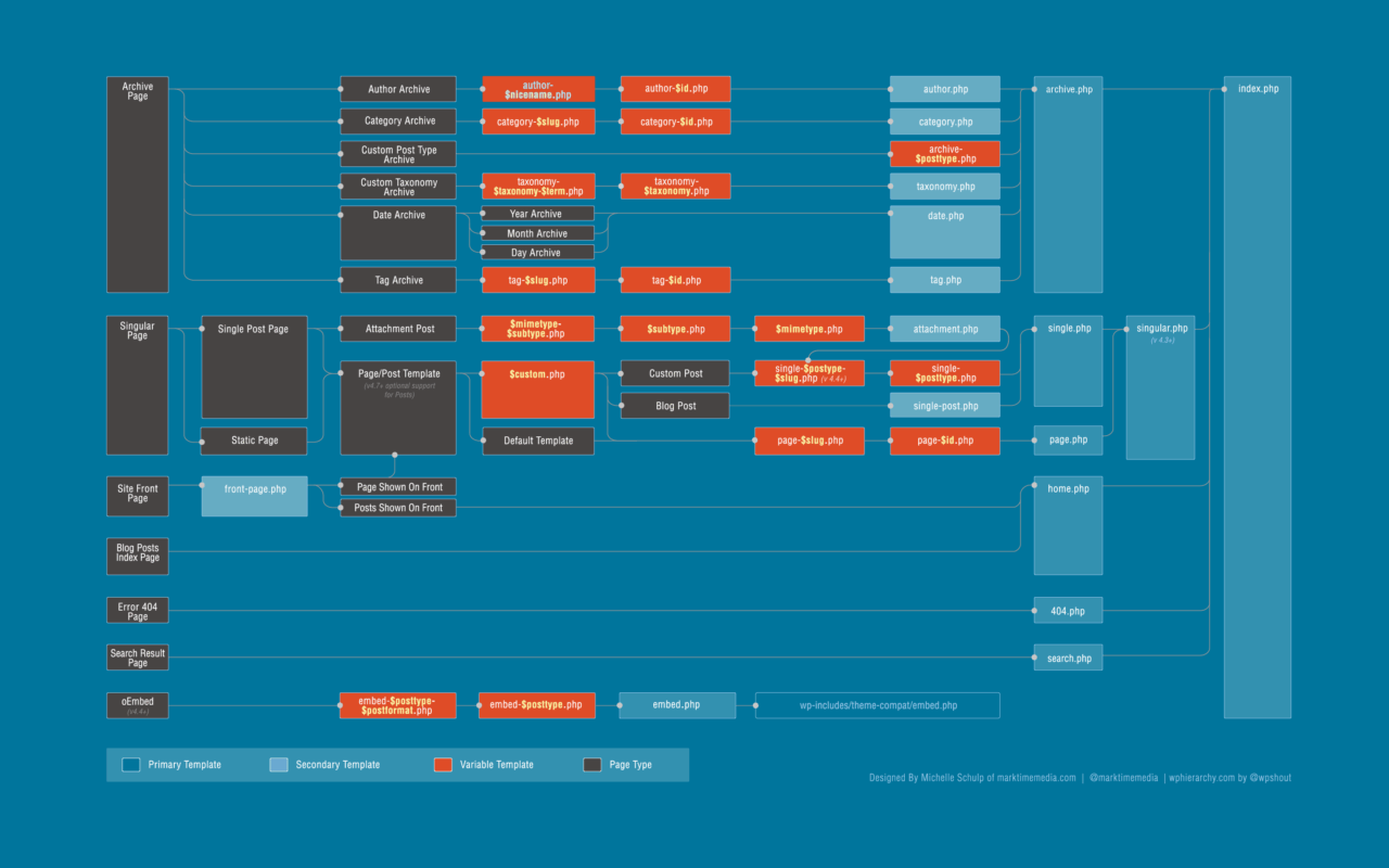
- テンプレート階層投稿者: tenman
- navigation投稿者: tenman
- 縦書き投稿者: tenman
hello world

hello world

おはよう
hello-world

