WordPressテーマは、多くのテーマがレスポンシブに表示できるようになっていますが、意外ととサポートされていないのが、ビデオなどのレスポンシブ設定です。
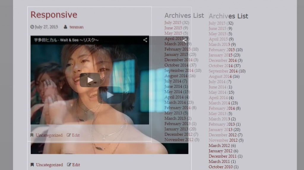
Twenty fifteenで、みてみましょう
ブラウザビューが1600pxの時には、660px x 495px で表示されるYoutubeビデオをブラウザ幅を小さく変更してそのサイズを見てみると、530px x 495px という風に幅方向は、ビュー幅に追従しますが、高さは 一定のままです。
Youtube 等、Oembed メディアのレスポンシブ対応は、現状 https://wordpress.org/themes/stargazer/(Stargazer) 等 ごく限られたテーマでしか、実装されていません
今回は、動画のレスポンシブ設定について考えてみたいと思います。レスポンシブ対応の方法
jQueryから、アプローチ
Currently Supported Players
YouTube Y Vimeo Y Blip.tv Y* Viddler Y* Kickstarter Y* * means native support for these may be deprecated.
If your video platform is not currently supported, try adding it via a customSelector…
fitvids.jsを使っているテーマ
- https://ja.wordpress.org/themes/blogbox/(blogbox)
このテーマを使って、実際に動画がサポート以外のプレイヤーの場合にどのように表示されるかを見てみます。
Youtube
TED
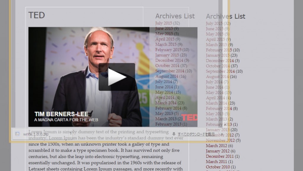
サポートしていない動画の場合は、やはりレスポンシブにはならず、幅方向だけが調整されています。
articleブロック(.hentry)には、白い枠線を追加していますが、枠線からオーバフローしていることも確認できます。
CSSから、アプローチ
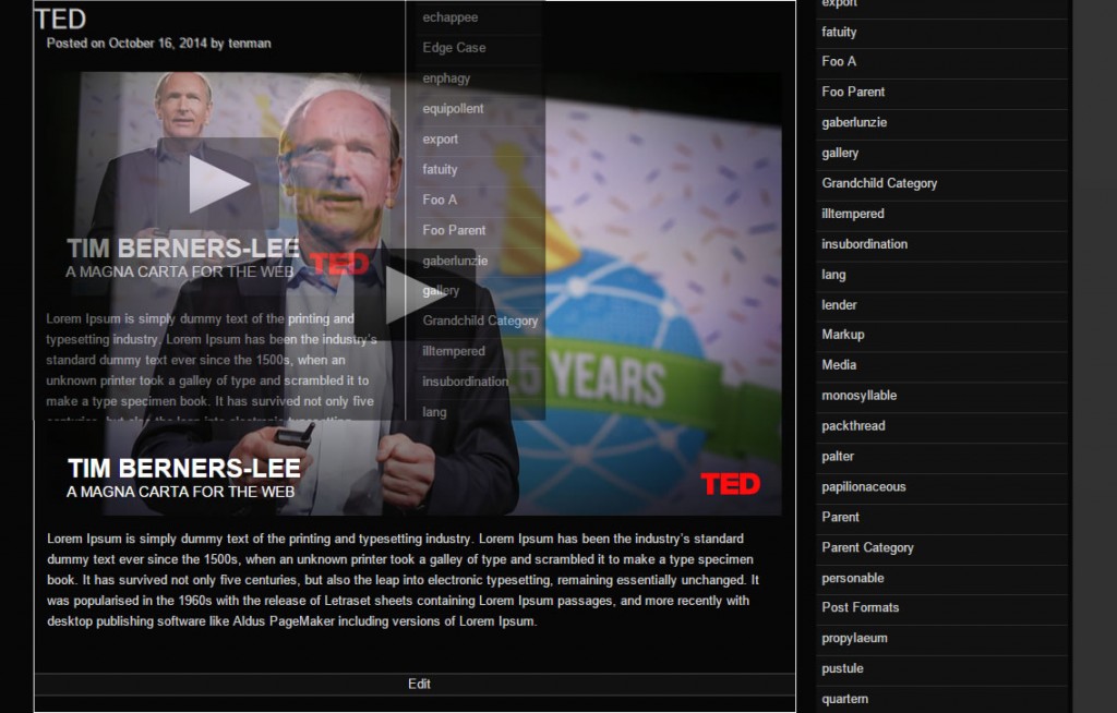
https://wordpress.org/themes/raindrops/(Raindrops)
Youtube
TED
CSSでの、レスポンシブ設定のベースになる考え方
padding―bottom に、アスペクト比を設定して、heightを0にしてしまう。
この設定を行うと、一定のアスペクト比でブロックを表示することが出来ます。
同様の考え方が、
等で紹介されています。
CSS Tricksでは、jQueryで、ブラウザのリサイズを検知して、レスポンシブな動画の表現の例が記述されていますが、
Raindropsテーマの場合、以下のようなフィルタとスタイルの組み合わせで、レスポンシブ対応しています。
add_filter( 'embed_oembed_html', 'raindrops_oembed_filter', 99, 4 );
if ( !function_exists( 'raindrops_oembed_filter' ) ) {

	/**
	 *
	 * @param type $html
	 * @param type $url
	 * @param type $attr
	 * @param type $post_ID
	 * @return type string html
	 * @since 1.246
	 */
	function raindrops_oembed_filter( $html, $url, $attr, $post_ID ) {
		global $is_IE;
		if ( ! $is_IE ) {

			$html= str_replace( 'frameborder="0"', '', $html );
		}
 // 以下の行は、Raindrops 特有の設定なので 必要ありません
		//$element= raindrops_doctype_elements( 'div', 'figure', false );

         // div figure等を指定してください。
 $element= 'figure';
		if ( !preg_match( '!(twitter.com |tumblr.com)!', $url ) ) {
			return sprintf( '<%2$s class="oembed-container clearfix">%1$s</%2$s>', $html, $element );
		}
		return $html;
	}

}
embed[src^="http://www.youtube.com/"],
embed[src^="http://v.wordpress.com/"],
embed[src^="//v.wordpress.com/"],
a[href^="https://www.flickr.com/"] img,
iframe[src^="https://embed-ssl.ted.com/"]{
 margin:auto;
 display:block;
 max-width:100%;
 max-height:100%;
 min-width:160px;
}
.oembed-container {
 position: relative;
 padding-bottom: 56.25%;
 padding-top: 30px;
 height: 0;
}
.oembed-container .issuuembed{
 clear:both;
 max-height:100%;
}
.oembed-container iframe {
 border:none;
}
.oembed-container{
 margin:0;
}
.oembed-container iframe,
.oembed-container object,
.oembed-container embed {
 position: absolute;
 top: 0;
 left: 0;
 width: 100%;
 width: -webkit-calc(100% - 2px);
 width: calc(100% - 2px);
 height: 100%;
 min-width:160px;
}
.oembed-container + *{
 margin-top:1em;
}
ただ、レインドロップステーマの場合、動画が常にコンテンツ幅いっぱいに表示されてしまいます。
でかすぎんじゃないの という場合は
Youtube 等の動画メディア(OEMBEDメディア)のサイズをコントロールする方法 を参照してください。
https://youtu.be/dpcHPVpjBCM
videoのレスポンシブ対応してみませんか?