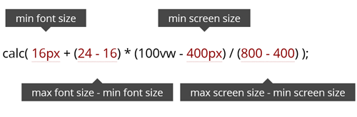
Embracing fluid typography might be easier than you think. It has wide browser support, is simple to implement and can be achieved without losing control over many important aspects of design. Unlike responsive typography, which changes only at set breakpoints, fluid typography resizes smoothly to match any device width. It is an intuitive option for a web in which we have a practically infinite number of screen sizes to support. Yet, for some reason, it is still used far less than responsive techniques.
Source: Fluid Typography – Smashing Magazine